The Rainbow Connection
In starting Project Color Corps, Laura Guido-Clark found that a coat of paint is a first step in empowering children and transforming schools.
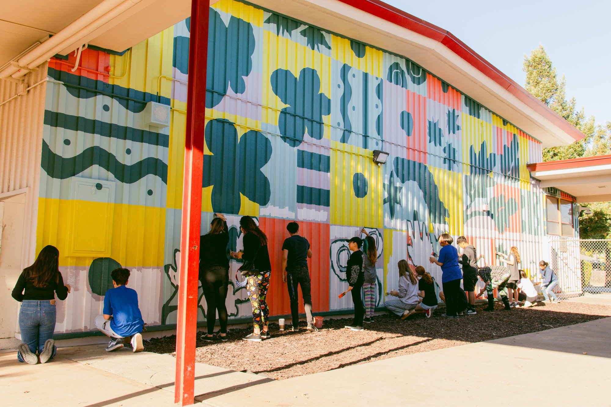
Students and Project Color Corps volunteers paint a new mural during “Paint Day” at El Dorado Middle School in Concord, California.
The minds of children are particularly receptive to color; the rainbow is one of the first vocabularies that they learn, and the hues allow them to absorb concepts easily—without losing emotional power. Laura Guido-Clark’s understanding of that power solidified when she saw The Wizard of Oz at the age of 10. “I realized that Oz was supercharged; it was full of hope and joy and wonder…” she trails off. “Films have such a short time to tell a story, and the fact that color was connected to story was a big part of their appeal for me.”
Connecting color to story became her mission, first as a textile designer, and subsequently as a color consultant and developer of the Love Good Color system, a methodology developed to help companies identify what they want out of their products’ palette. One of Guido-Clark’s major successes is Herman Miller’s Cosm Chair, for which she designed and curated three unusual, yet universally appealing hues. Typically, people browse the eclectic colors for big furniture purchases, and then pick standard navy blue, beige, and burgundy for their final selections, but with the Cosm, “People were ordering colors like they were ordering neutrals,” she says.
In shepherding such vibrant hues into everyday spaces, Guido-Clark often remembered her childhood reaction to the Yellow Brick Road and the Emerald City—and, like Dorothy, wanted to bring wonder back to spaces where children congregate; these settings had the possibility to be full of hope, but typically lacked that chromatic excitement. “The beauty of youth is that they embrace color. There is no fear of color. Sometimes when I work with my [adult] clients, they are a little more fearful.”
The means of connecting Oz’s Technicolor world and her own expertise to more people, and younger people, came to Guido-Clark in 2011 when she had a dream that she was talking to President Obama. “He was talking about hope and change and he had a paint can in his hand,” she remembers. “I realized I needed to take color beyond my own clients, that it could be a powerful medium for good.”
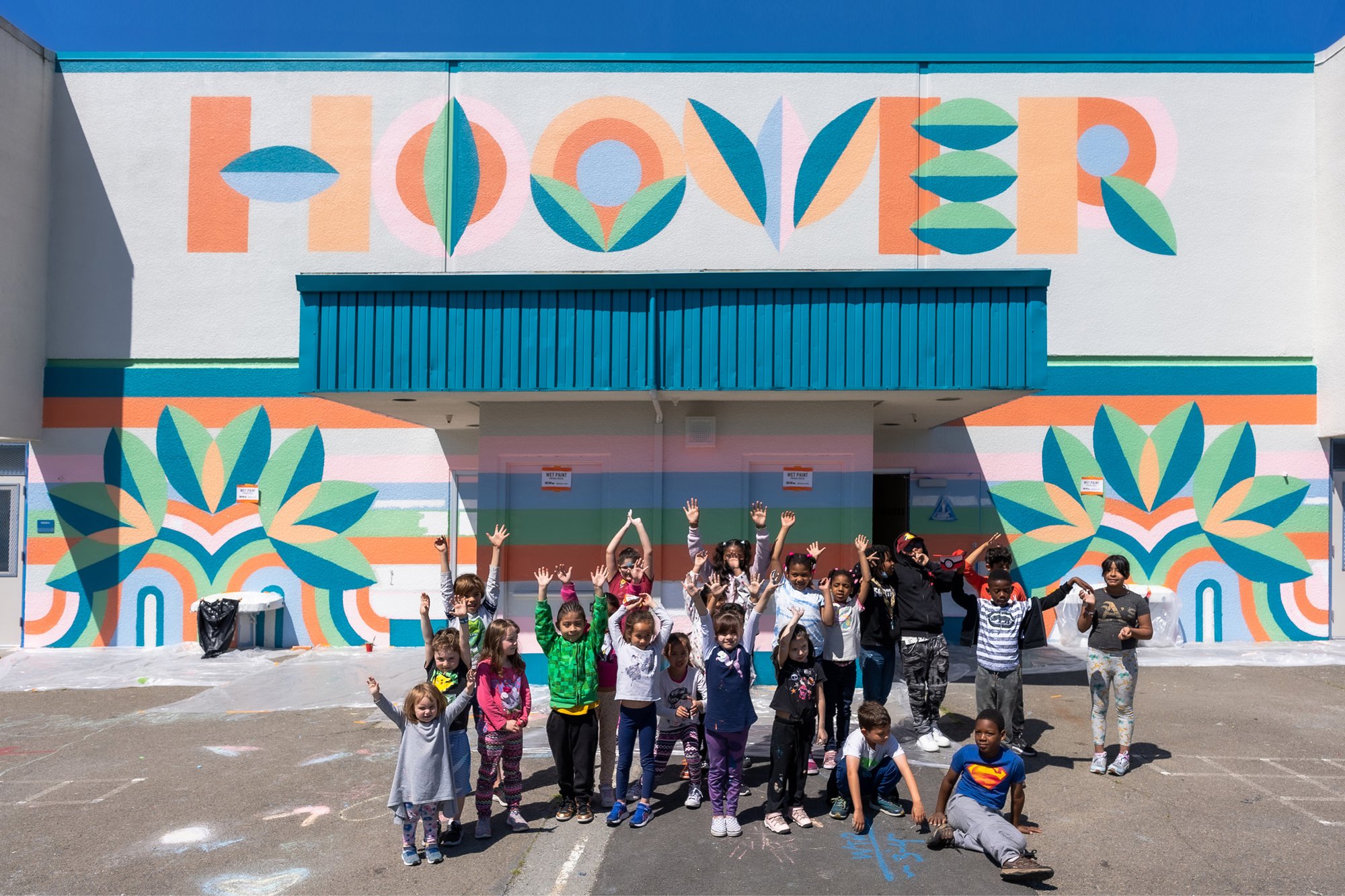
At Hoover Elementary, in Oakland, California, the students’ mural was inspired by oak trees and themes of “kind” and “safe.” Photograph courtesy of Project Color Corps.
Guido-Clark felt that to enact such a transformation, she needed to empower children, since they are typically deprived of opportunities to choose color for their world, beyond personal items. Their day-to-day lives—commutes, schools, even playgrounds and rec centers—are so often painted for expediency rather than joy: walls and backgrounds rendered in dull, neutral hues. Guido-Clark sought to remedy that, working from the hypothesis that the vibrancy conveyed through color and design would have a significant impact on youth in settings associated with learning.
She founded Project Color Corps, now a 501(c)(3), in 2011 and launched it with “a random act of color” that could be seen from one of the Bay Area’s subway lines: “I took all these old CDs, painted them, and strung them on a tree in a lonely park.” It looked like a necklace, a brave accessory for an unloved space. She started to look at, and for, other unloved public spaces that could be transformed, through pattern and color, into evocative visual representations of their vital role, and that pushed back against an institutional aesthetic. “Where I really struggle is how prison-like the schools are. How do you muster a level of self-respect when everything around you says we are not respecting you?”
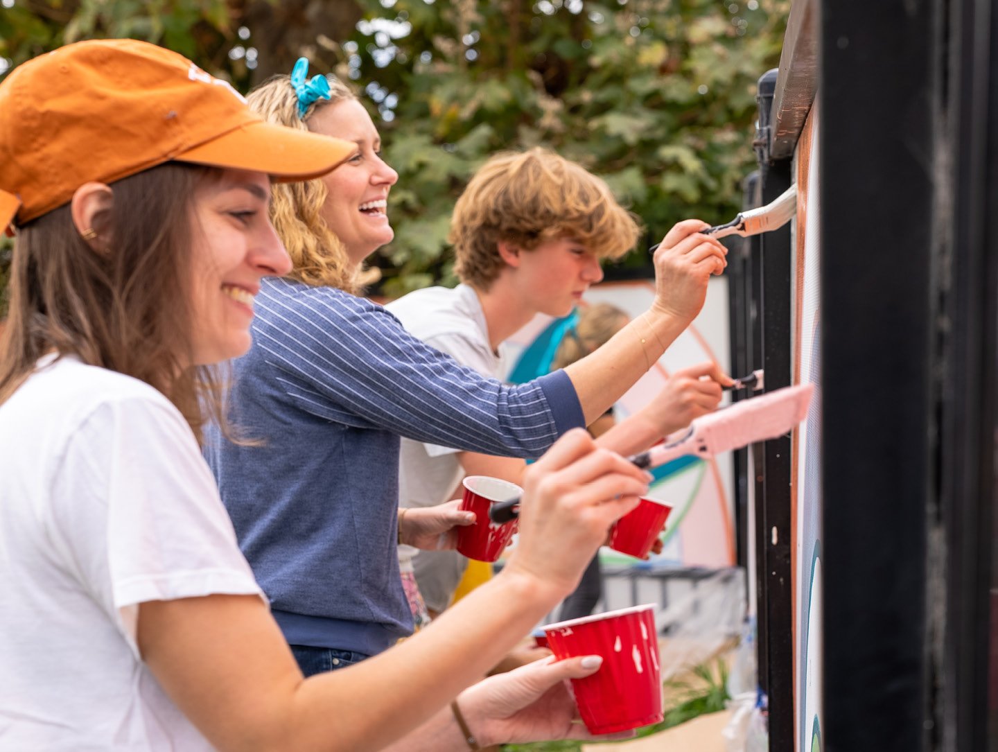
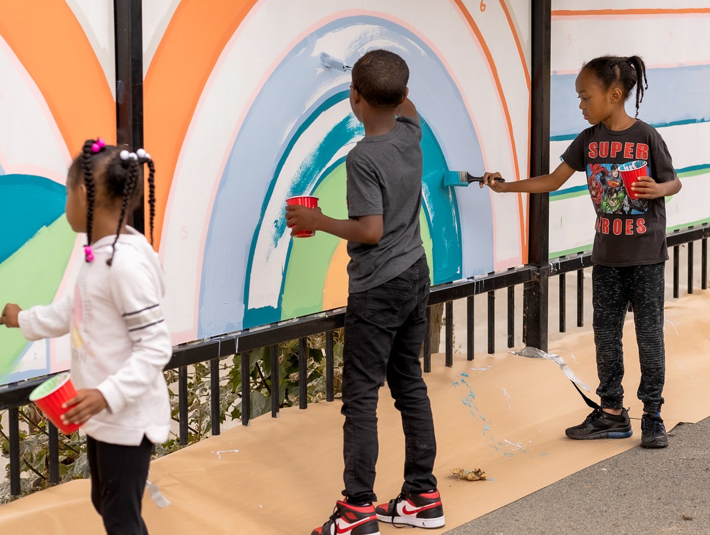
Students and volunteers paint the Hoover Elementary mural featuring natural motifs designed by Bay Area firms BAMO and SWA. Photographs courtesy of Project Color Corps.
For Guido-Clark, Project Color Corps would be the means of fostering self-respect, and she began cold-calling schools that could be potential sites. That led her nowhere, until a friend introduced her to Lisa Blair, the principal of K-8 charter E.C. Reems Academy in Oakland, California. The school, which became Project Color Corps’ first client, is housed in a low-slung modern concrete building, whose entrance faced a paved schoolyard and abutted a largely blank three-story wall. It was functional but hardly inspirational, a stark contrast to the vivid, poppy nouns students supplied when Project Color Corps conducted an initial survey about students’ aspirations for their environment.
Guido-Clark and Project Color Corps’ language of respect, and its integration into design methodology, is a touchstone for her work. Over the past few trying years, design theorists have taken up the idea of “an architecture of care” that fundamentally changes the design process to include community input before, community labor during, and collective maintenance after a building, plaza, or park is commissioned. The Project Color Corps playbook, developed during the past decade plus, adheres to that community-based participatory model, offering multiple invitations for students, caregivers, teachers and administrators to take charge of their buildings and playgrounds.

Student surveys have become part of Project Color Corps’ standard practice, which begins by polling students and teachers about their favorite colors, their feelings about certain colors, and how they want to feel in their space. The Project Color Corps team transmutes those into word clouds and pulls out recurring words and phrases that differentiate this school community from others. Those words, plus the colors the school community picks from big piles of paint chips, become the basis for architecturally-scaled paint interventions designed by professionals.
At E.C. Reems, Tolleson Design designed two mural options for the school to vote on: Happy Rainbow, with lots of pinks and yellows, and Magical Energy, with more greens and blues. The school chose the latter. Now a bank of sunshiny yellow windows tops the entrance, and the three-story wall is alive with shapes that suggest trees, moons, suns, houses—whatever the kids, and adults, imagine.
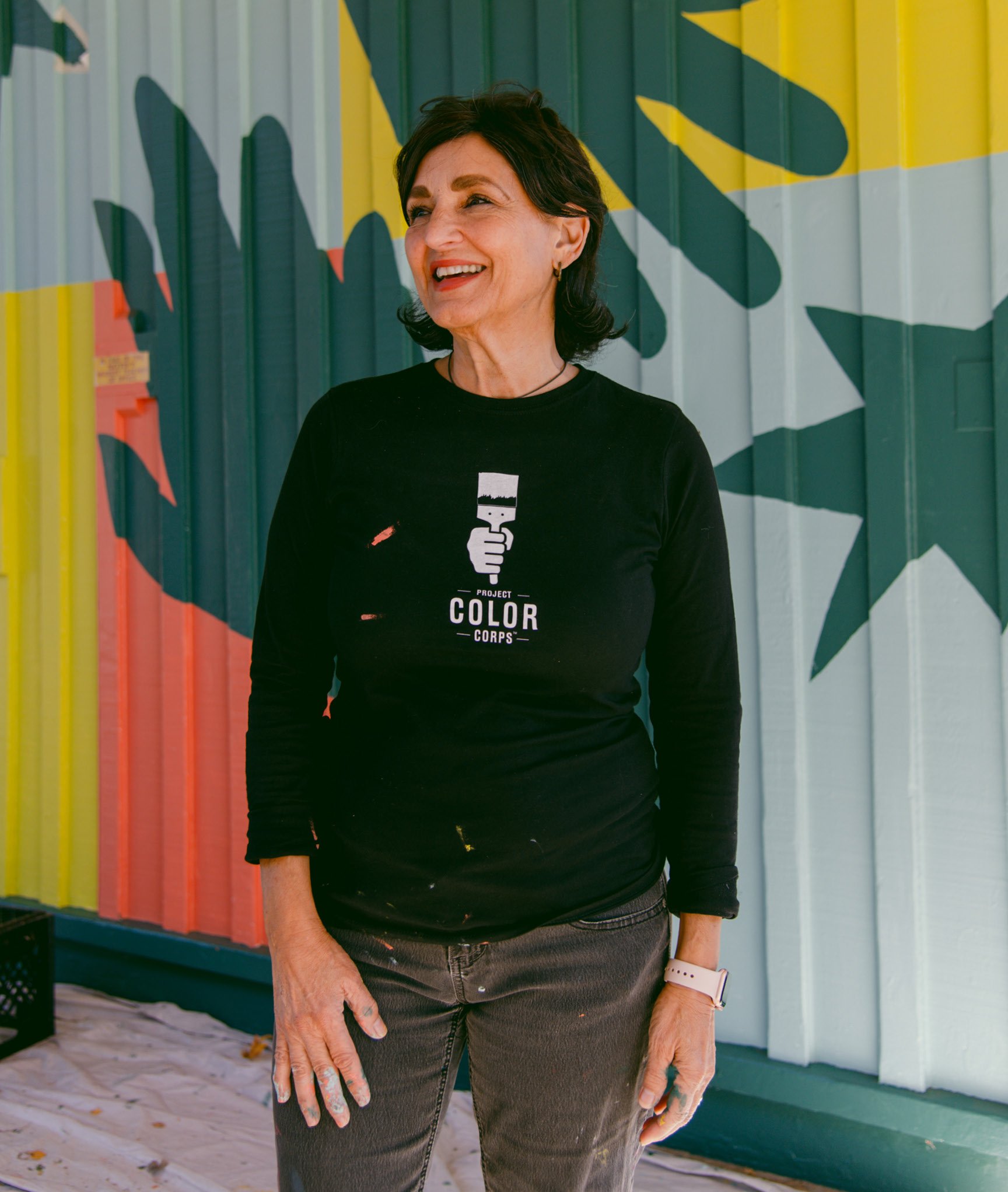
The beauty of youth is that they embrace color. There is no fear of color.
Laura Guido-Clark
Founder
Project Color Corps
The notion that the built environment and architecture have an impact on psychology is not a new concept; it is, rather, a fundamental principle that has shaped the design of buildings and their settings over centuries and that has more recently been codified and studied. The WELL Building Standard, a certification system for structures that meet criteria for physical and mental well-being, was introduced in 2013. And architects working on institutional projects in recent years have turned to neuroscience to justify spending on more plants, more natural light, and, yes, more color, to ensure that employees, students, caregivers, and providers feel nourished in the places where they spend their days. Architects working on children’s libraries let kids build models; designers in health-care settings make sure breakrooms are places of respite and not an afterthought; and a color consultant like Guido-Clark brings a mountain of samples, as if to say, The world of color is vast, let yourself swim in it.
Students at the schools tend to already understand the shifts of meaning and resonance made possible through color: “We ask questions like, ‘What would happen if we change the color of one thing they know, like change the McDonald’s sign to green?’” notes Guido-Clark. “And they say, ‘Well, then that’s the healthy McDonald’s.’” The Project Color Corps team will also choose kids to stand up and read their responses to prompts like, “Pick your two favorite colors and write a short sentence about how they make you feel.”
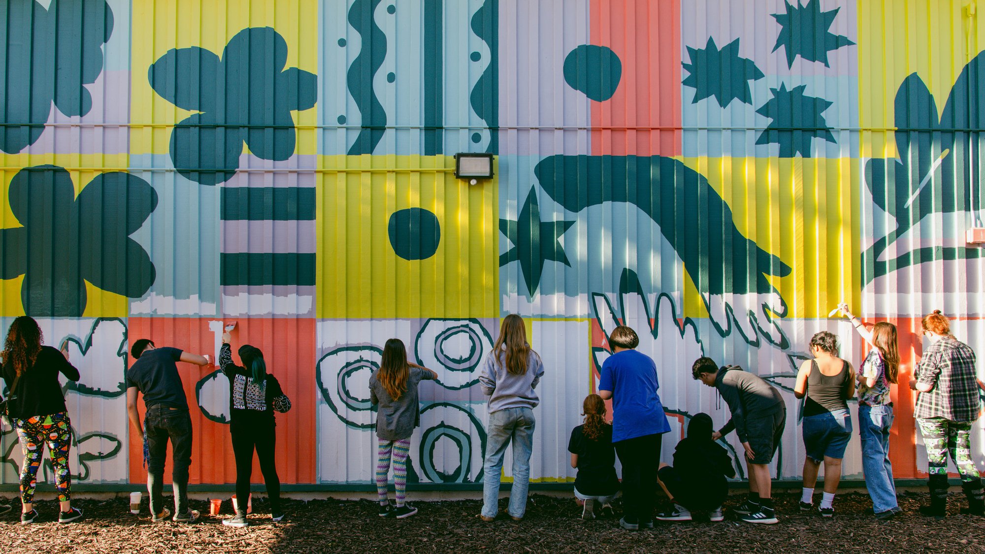
For the mural at El Dorado Middle School, students chose the “smart energized” thematic scheme created by San-Francisco–based Morla Design.
Guido-Clark sees parallels to the connections students make through these exercises in another, more contemporary film—Pixar’s recent hit Inside Out 2: “Every emotion is assigned a color. Sadness is the blue character, Anger is spouting red. They use color a lot to help identify and reinforce those emotions in their storytelling.”
It isn’t just strong emotions either: Lissette Averhoff, the principal at Oakland’s Hoover Elementary School, a Project Color Corps client, says that the Color Corps exercises taught her a few things as well. “I learned a lot about color and space and what different types of energy you want in different spaces,” she says, and she sees the effects of that knowledge in her school to this day. “Walking down toward the yard, there is a little slope, and kids tend to run.” She and the Project Color Corps team picked a soothing shade of orange “so they would transition smoothly and calmly to the yard, and then we have the garden painted green to make it more cohesive.”
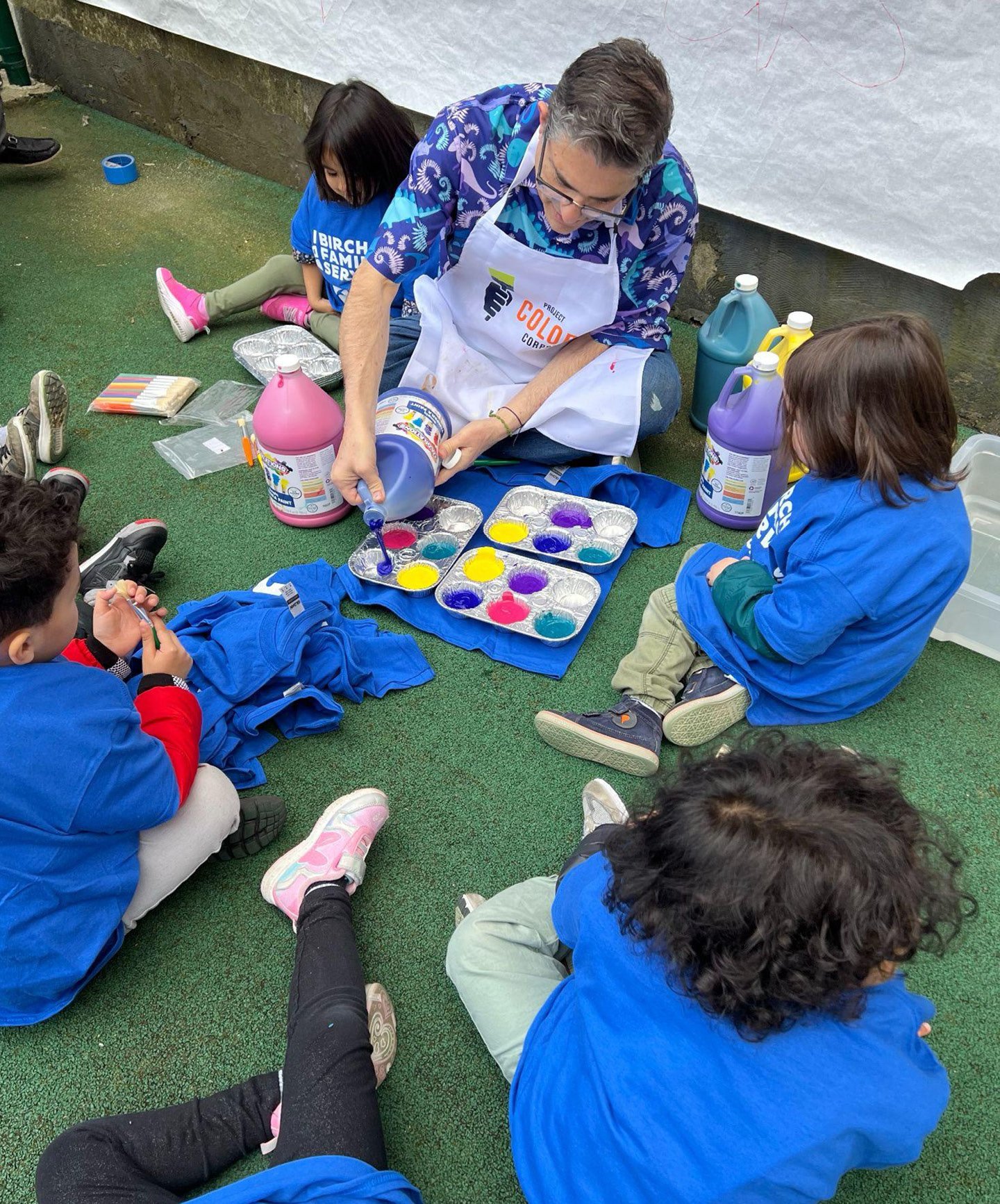
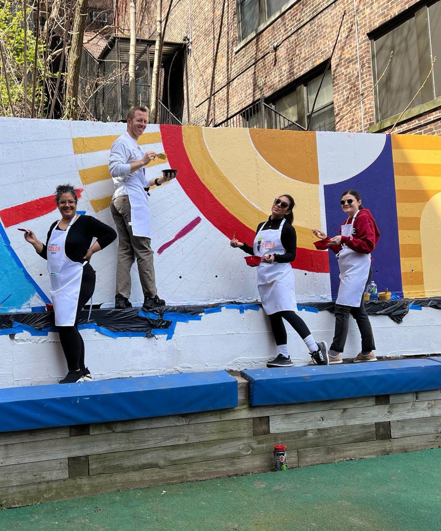
At Birch Family Services in Manhattan, volunteers and students created a colorful backdrop for a preschoolers’ play area. Photographs courtesy of Project Color Corps.
Beyond its community-based creative process, Project Color Corps helps ensure community buy-in, and group maintenance, by inviting students, teachers, parents and local residents to a “Paint Day.” This underlines the idea that the murals aren’t being imposed, but are more of a group project; care theorists believe this helps solidify pride and identity in a new intervention. As a bonus, these Paint Days allow children and their parents to show off skills that aren’t always part of the school day.
Fabiola Catalan, an interior designer, then at Gensler, who volunteered with Project Color Corps for a project at Cambridge Elementary School in Concord, California, in 2015, remembers that at that school’s Paint Day, most parents were coming in asking, “What do I paint? What’s my color?” Typically, volunteers are given the easy jobs, with professionals doing more intricate mural work. “But one dad came, dressed in all white, with a bucket, a roller, brushes, painter’s tape, butcher paper. He painted for a living. His daughter was a first grader and she was so proud.”
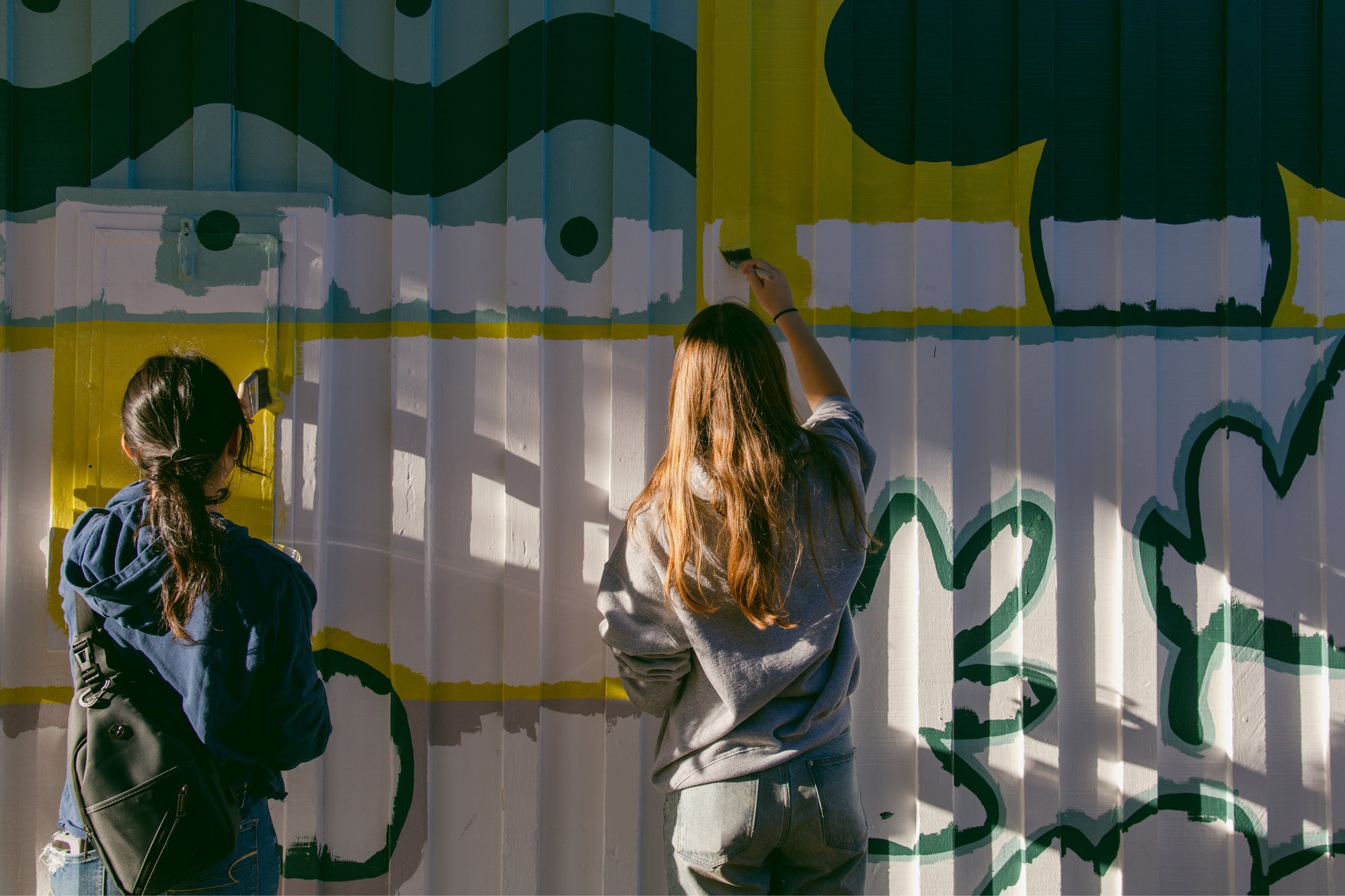
To date, Project Color Corps has completed projects for nine schools, as well as for several community centers. The organization now has four chapters across the country, with two school projects currently underway in California and Oregon. Sherwin-Williams is a frequent paint sponsor, with Portland-based, employee-owned Miller Paint contributing to that city’s works.
One of the ongoing gifts of Project Color Corps is its effect not just on the physical environment, but in activating the colorful imagination of participants to extend that care to other parts of their schools and communities.
When interior designer Catalan worked with Project Color Corps, she mostly did corporate office design; after becoming a mother, and working through the pandemic, she decided to switch gears, and became a senior associate at DLR Group working on educational settings. Her current project is a ground-up elementary school in Mission Bay, San Francisco. “I literally had my Laura Guido-Clark hat on, looking at colors, looking at graphics,” she says. “With public work there is always a low budget, so for me that meant color through paint and designing graphics that connect with students.” She describes the school’s color scheme as “natural colors but not primary colors, youthful but also timeless.”
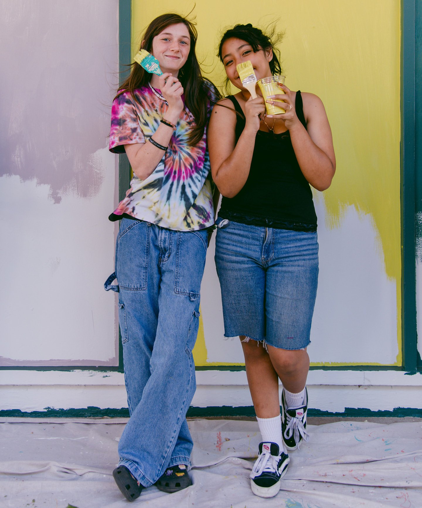
This fall, Project Color Corps will be working on a second school in a community where some of the second graders who were involved in the first project are now attending the high school that is the site of the new intervention. Several of them remembered Project Color Corps’ community events from the first time around, and asked if they could have their own color class, above and beyond the engagement exercises that are a standard part of the process. Guido-Clark wants to do it but is also mindful of making it fit with California state curriculum: “It’s hard when the kids are tested on so many things to get into something that they want to learn about.”
When Project Color Corps completed its project at Cambridge Elementary, Megan Estenson was a teacher. By the time she reconnected with the organization in 2023, she was a principal, now at El Dorado Middle School, also in Concord, and contending with the pandemic’s aftereffects on schools. “After the COVID years, we lost some of that community connection,” she says. “I wanted to bring in that voice from the community; that engagement and connectedness to the school” that she had seen when Project Color Corps came in with their multi-step process.
As a principal, her perspective on the space of school had also changed. “As a teacher, sometimes you are isolated in your four walls” of the classroom, she says, but “seeing the impact around the feeling of color on campus, thinking, What do the kids see every day?” has transformed the way she evaluates the corridors and the courtyards of the middle school’s larger site. She sees what has already been cared for, but also gaps that she—along with the students and wider community, armed with an understanding of what paint can do—could fill in: “What do I need to beautify?” ❤
Alexandra Lange is a design critic and author of Meet Me by the Fountain: An Inside History of the Mall.
Marissa Leshnov is a Black and Russian American photographer based in Oakland, California, whose work explores the complexity of intersectional identity and belonging in the American West.
At Kazam! Magazine we believe design has the power to change the world. Our stories feature people, projects, and ideas that are shaping a better tomorrow.