Artist as Art Form
In work that segues from gorgeous fields of color to everyday inanities, Daniel Eatock defies categories, proving he has one muse: the process itself.
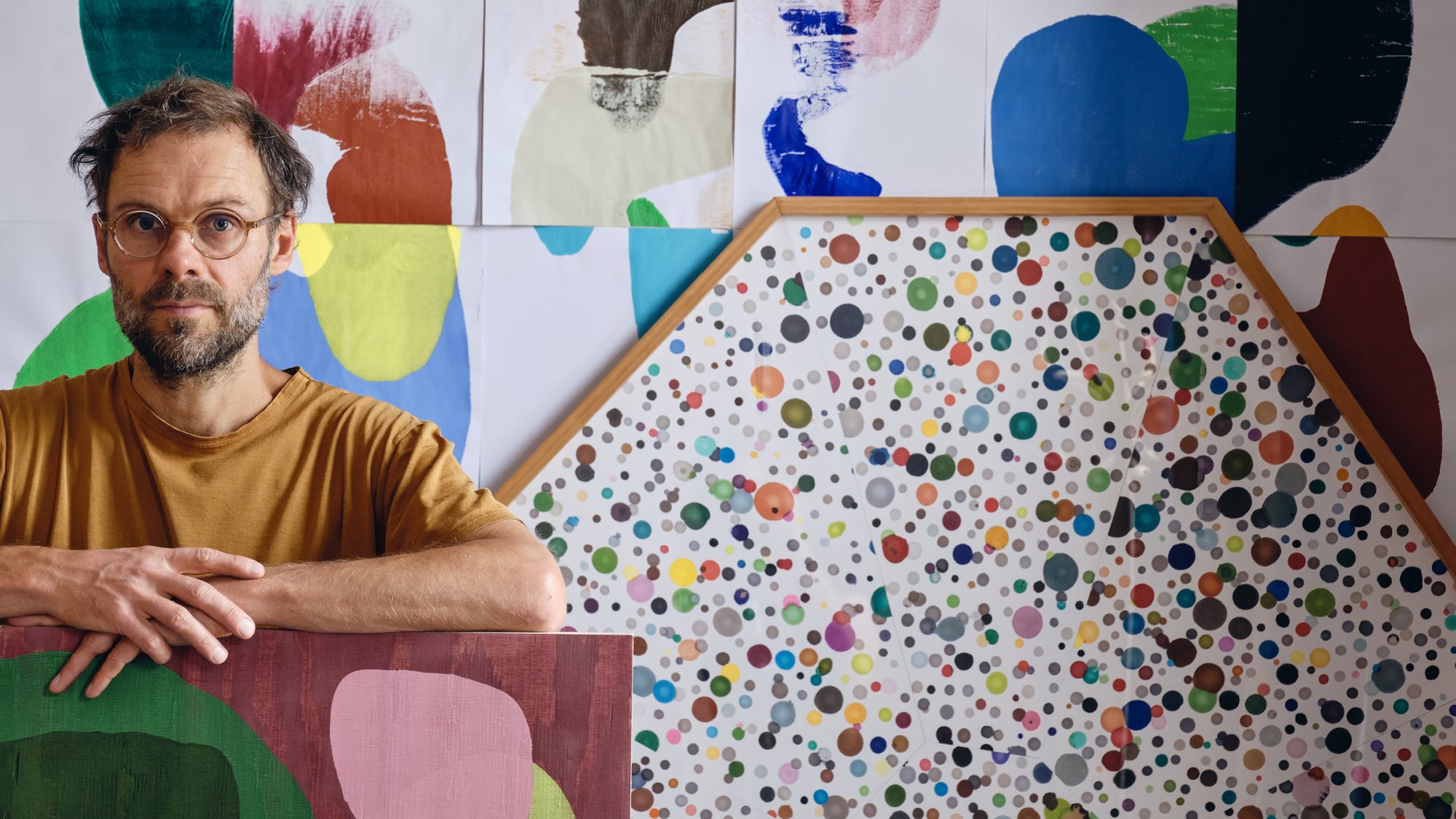
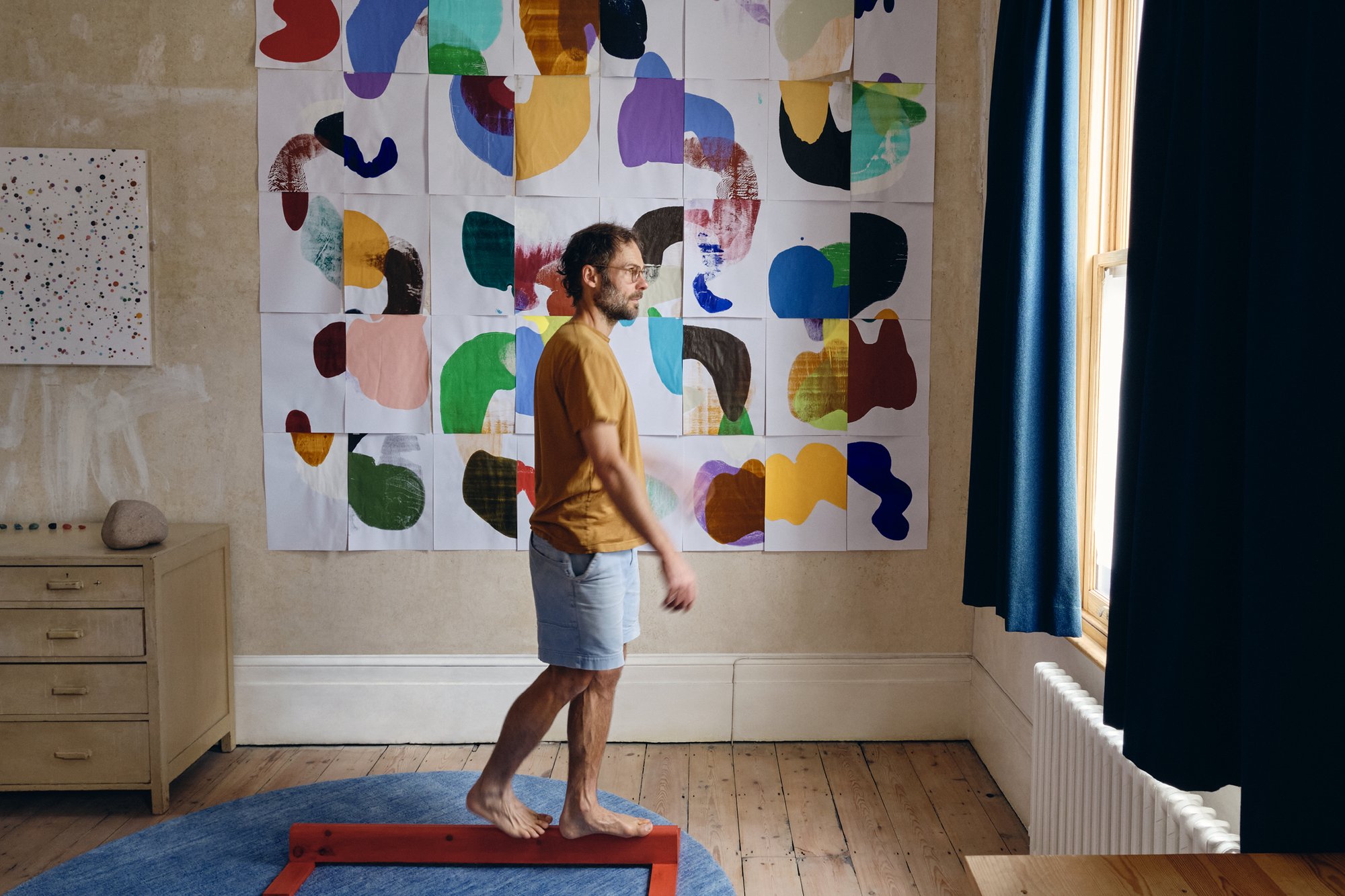
Daniel Eatock stands in his London studio amidst a sea of his work, including Assembled Rolled Forms and a Felt-Tip Print in an octagon frame.
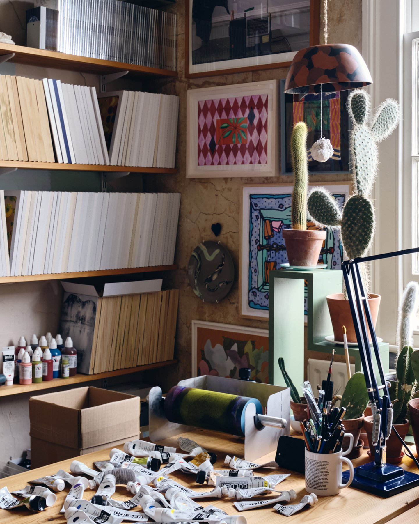
Daniel Eatock’s London studio is ablaze with thinking and making: “I try to make something every day,” he says. “Even if I’m traveling, or dealing with the responsibilities of being a parent, there is always an idle moment when I can take the opportunity to be creative.”
To his many admirers, Eatock represents a paradigm of creative production. Surveying his vast body of work, a paradox emerges. At first glance it appears to be an obsession with the banal, and a by-product of happenstance—in ongoing projects, he documents images of ill-conceived repairs to motor vehicles, maintains a collection of found lost luggage labels, gathers pictures of vandalized trees in public spaces, and enlists the public to submit photographs with dangling camera straps intentionally included. But dig beneath the surface, and a highly methodical, process-driven, and individualistic voice emerges.
This process-driven approach is best represented by his Felt-Tip Prints. First trialed when he was pursuing a master’s degree, they are made by placing felt-tip pens facing upward or downward in a gridded container and then resting sheets of absorbent paper on the tips—sometimes one sheet, sometimes many. Left in position for varying durations, the ink bleeds through the paper, creating pools of vivid color with varying intensities.
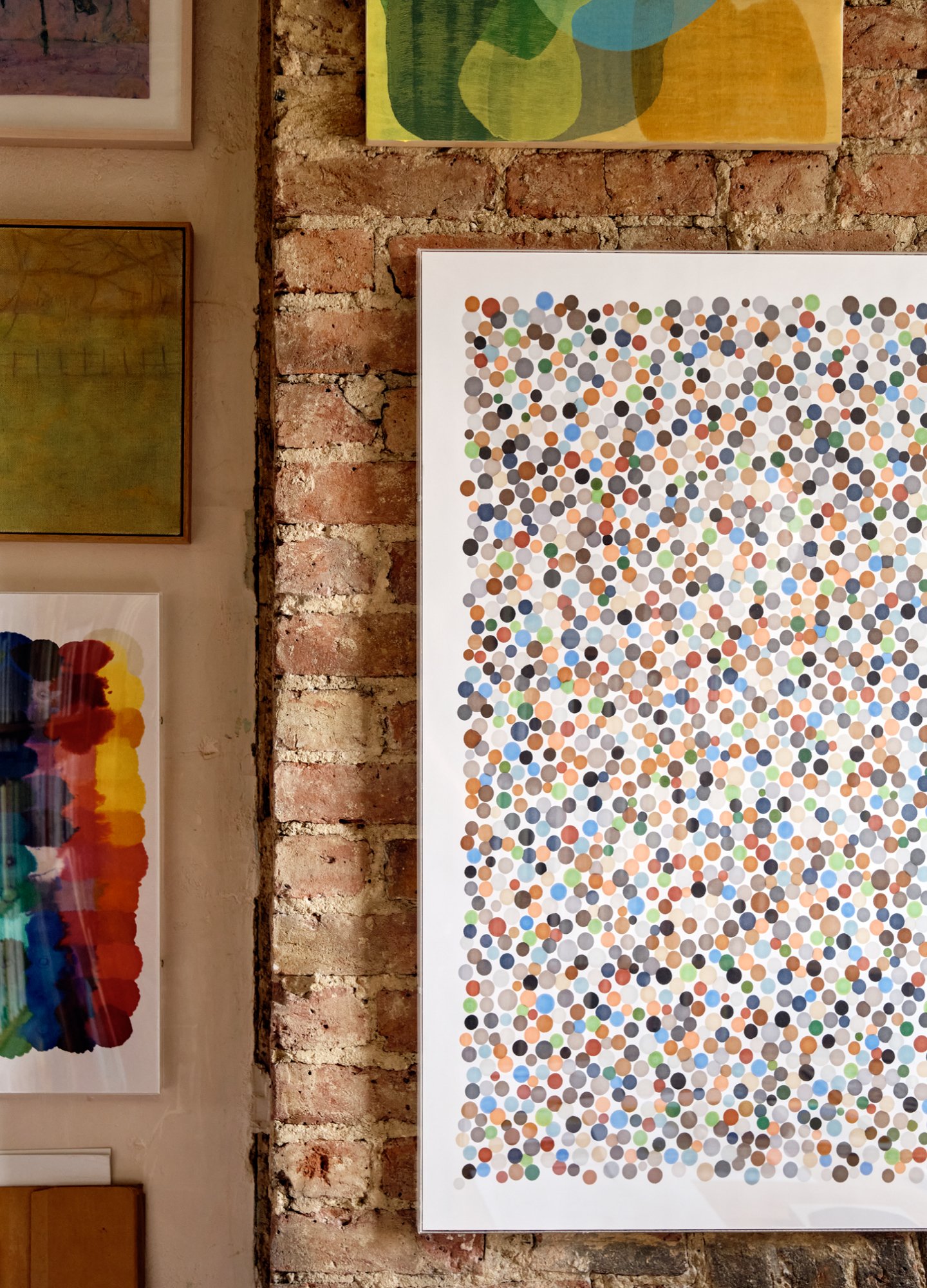
An Eatock Felt-Tip Print made with “architectural tones” from Winsor & Newton’s ProMarker line, held stationary on paper for varying durations.
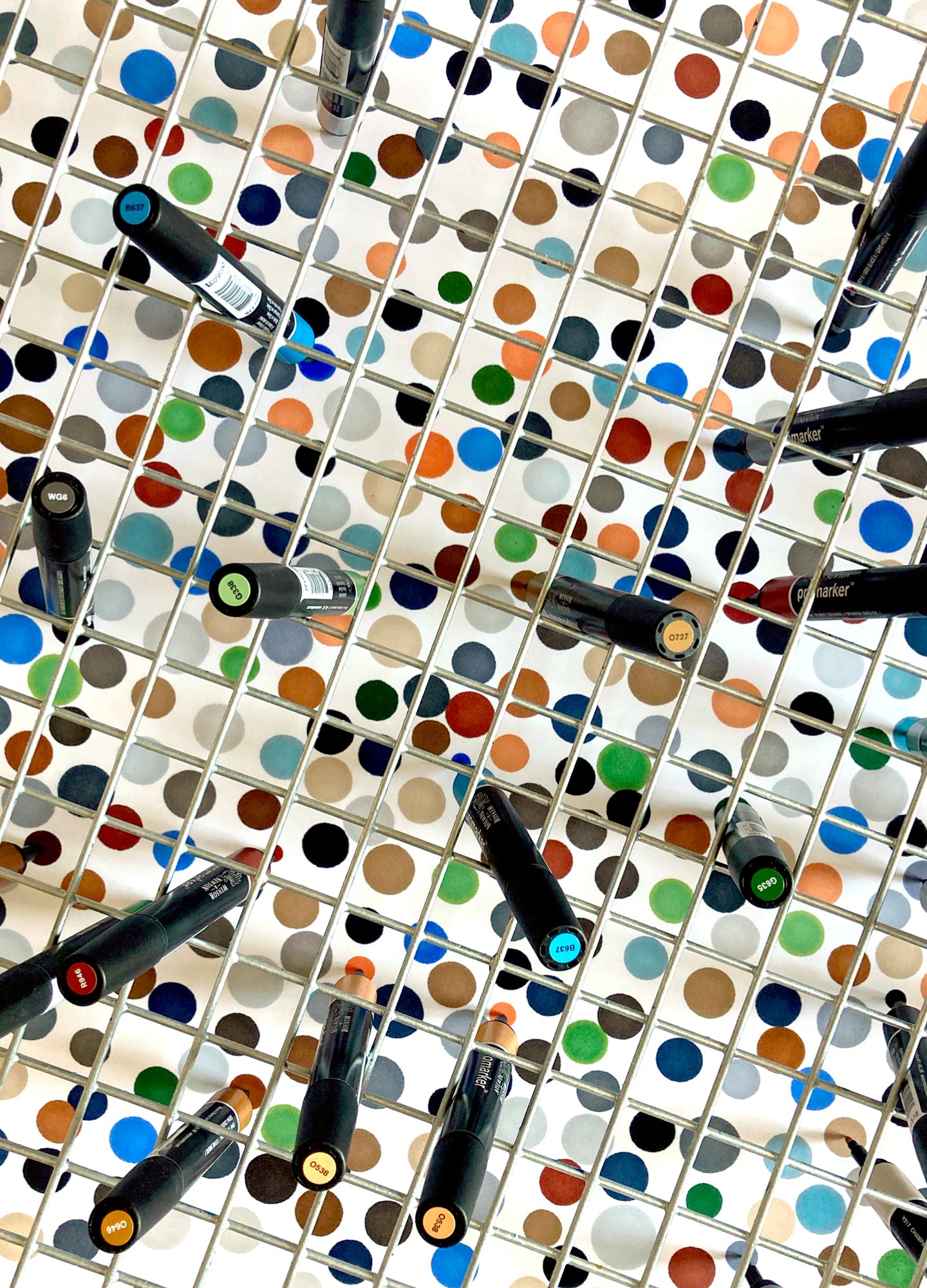
The outcomes are largely unpredictable, and the unpredictability of the art-making process (should you be aware of it) only adds to their beauty. The determining factors are Eatock’s choice of pen color, the positioning of the pens, the quantity of sheets, and the amount of time pen and paper remains in contact. As he recalls on his website: “Frustrated with my drawing abilities, I embraced my frustration and removed my hand from the process and let the pen make the work. Thirty years later, I am still exploring the same process and materials.”
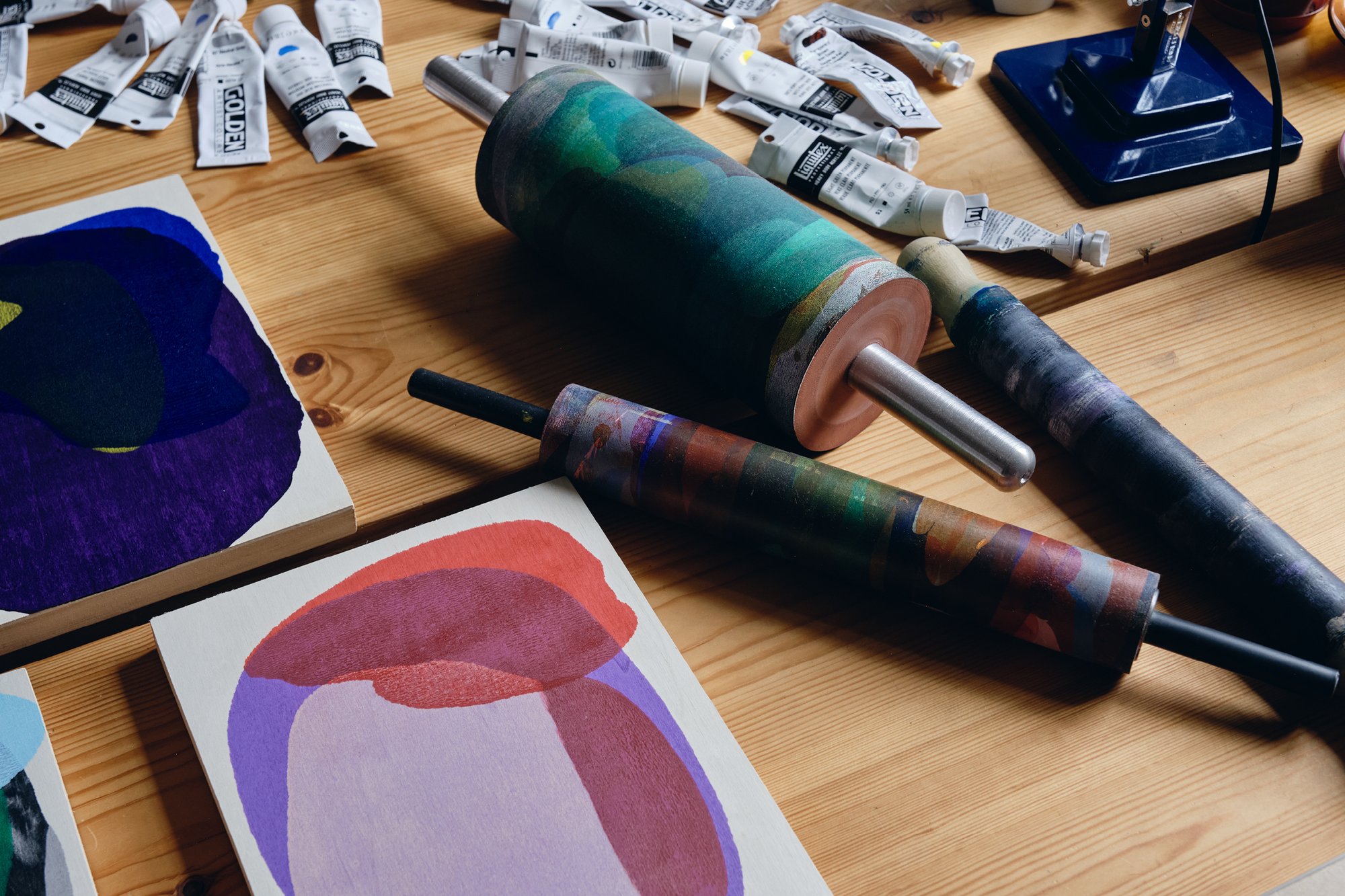
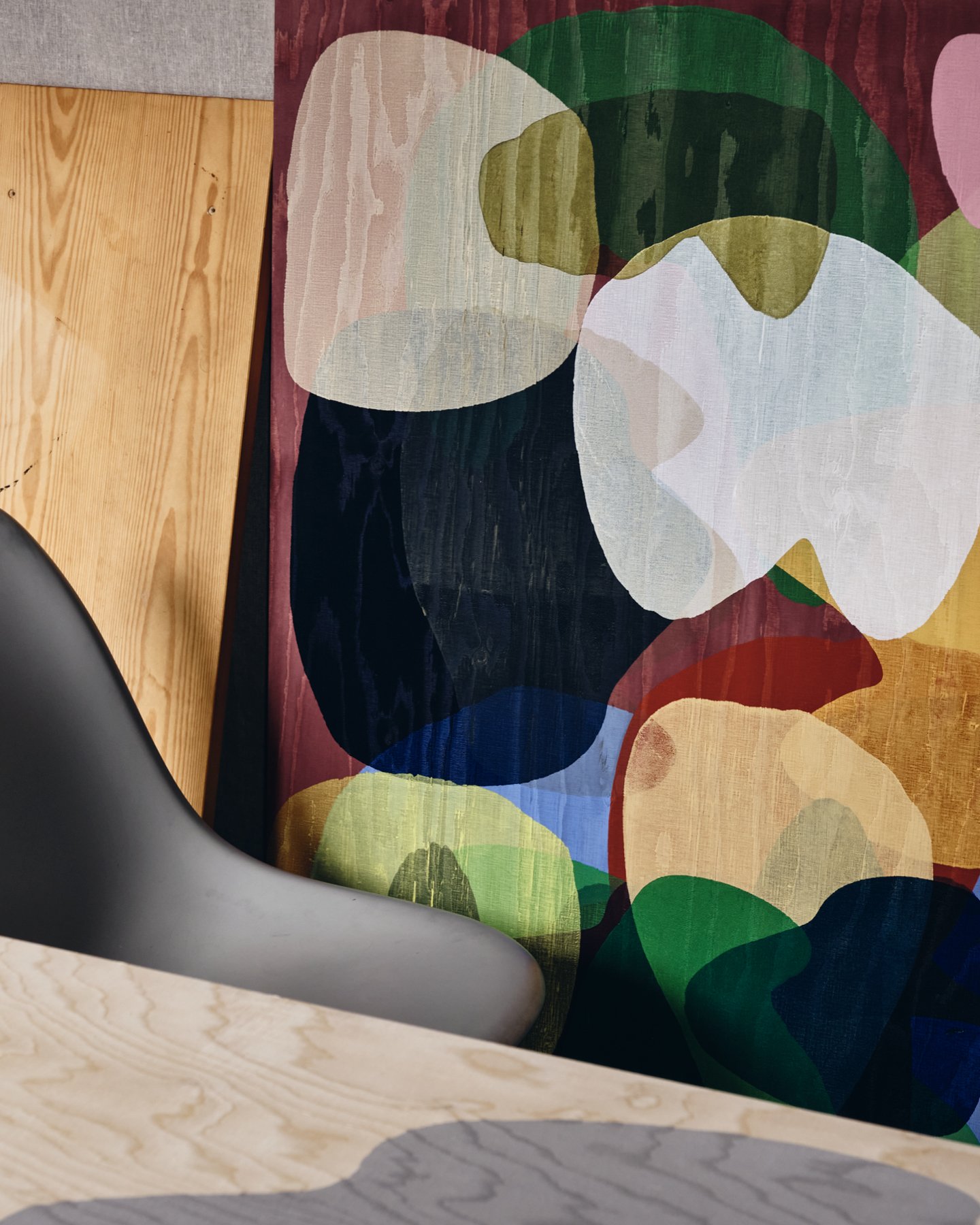
Eatock’s Rolling Pin Paintings, made initially with the ubiquitous kitchen tool, follow a similar model of construction. “The forms that emerge appear anamorphic, stretched, and dilated,” he observes. “Colors collide with the rolling, the action creates the composition using the location of the paint’s application as their starting points. Like a journey undertaken when a destination is unknown, the painting materializes with the action.” In other words, the making of the work becomes the work itself.
The poles of mundane and beatific define Eatock’s work, which further resists categorization. Is it art? Is it graphic design? Since he is neither represented by a gallery nor servicing commercial clients, both of which might want to vacuum-pack him into one or other of these designations, he feels no compulsion to attach a label to what he does. And if we take another random specimen of his vast output, for example, the films of him dancing frenetically to the howl of car alarms, we see work that might be classified in many ways: performance art, new-era comedy, a socio-political statement about urban noise pollution.
Eatock leaves it to the viewer to decide. The question of whether he makes art or design does not concern him. Yet it’s not hard to imagine a hip London gallery promoting him as the bright new face of British art. He spent seven years studying graphic design, which conceivably could have elevated him to a comfortable career in a fashionable branding studio or as the creative director of a progressive advertising agency.
But comfort is not part of Eatock’s sensibility. He spurns the security that comes with being yoked to a discipline. Nor, for that matter, does he crave physical comforts. He recently contemplated getting rid of all the furniture in his house and replacing it with austere monkish constructions of his own making. Only consideration for his wife and young daughter prevented him from proceeding.
In making a Rolling Pin Painting and a Clip Frame Painting, Eatock combines meticulous preparation with an unpredictable art-making process.
Eatock’s seeming fascination for the banal, as evidenced in the images he gathers, can be viewed as simply cataloging the ephemeral. But they also harken the legacy of the Smile in the Mind school of British graphic design. Fashionable in the 1970s, this sensibility privileges the idea—usually a witty idea—above everything else. Paul Rand’s famous IBM rebus—an image of an eye, a bee, and the letter M—is effective because it is instantly understandable. This, and other examples, function because they rely on the conceptual abilities of the viewer and are carefully calibrated to elicit a predetermined response.
While some of Eatock’s creations near this categorization, he insists his approach is different. “I’ve never created work to try to get some response,” he claims. “The wit or humor in my work comes from an angry place, based on conflict, sarcasm, pointing out the ridiculous and stupidity of the everyday. I feel more aligned with Andy Kaufman and Steven Wright than Alan Fletcher and Bob Gill.”
Just so, as viewers encountering his work, we experience the mildly destabilizing realization that Eatock is bringing our attention to the kind of visual data we encounter every day but have somehow failed to ever actually see.

Art doesn’t have to be about aesthetics. It can be about ideas. I realized I liked art, but I really loved ideas.
Daniel Eatock
Artist
This penchant—emphasized through repetition in his work as he riffs on themes like a musician—creates an unexpected resonance with the work of Ray and Charles Eames. Eatock offers admiration for the Eamesian philosophy of finding beauty in the ordinary. And what, after all, is more ordinary than a humble motor car with a wrongly colored panel patched into factory-made bodywork, or a camera strap caught in a photograph?
While Eatock always loved to draw (a teacher called him “little Picasso”), his journey toward the uncategorizable accelerated when he enrolled in a graphic design diploma course as a teen. The two-year curriculum, designed for young people uncertain about their future career, confirmed for Eatock that he had found his path. He went on to study graphic design at the bachelor’s level at Ravensbourne, a school with a strong tradition of teaching modernist typography. Finally, he was accepted onto the Communication Art & Design MA program at the Royal College of Art in London.
While at Ravensbourne, Eatock made an important discovery in the school’s library. The book Six Years: The Dematerialization of the Art Object from 1966 to 1972 by Lucy R. Lippard helped shape a notion that had been fermenting inside him since his school days. Lippard’s book explores the way some 20th-century artists abandoned making aesthetic objects and instead embraced ideas and actions. “The book changed everything for me,” Eatock says. “It helped me see that art doesn’t have to be about aesthetics. It can be about ideas. I realized I liked art, but I really loved ideas.”
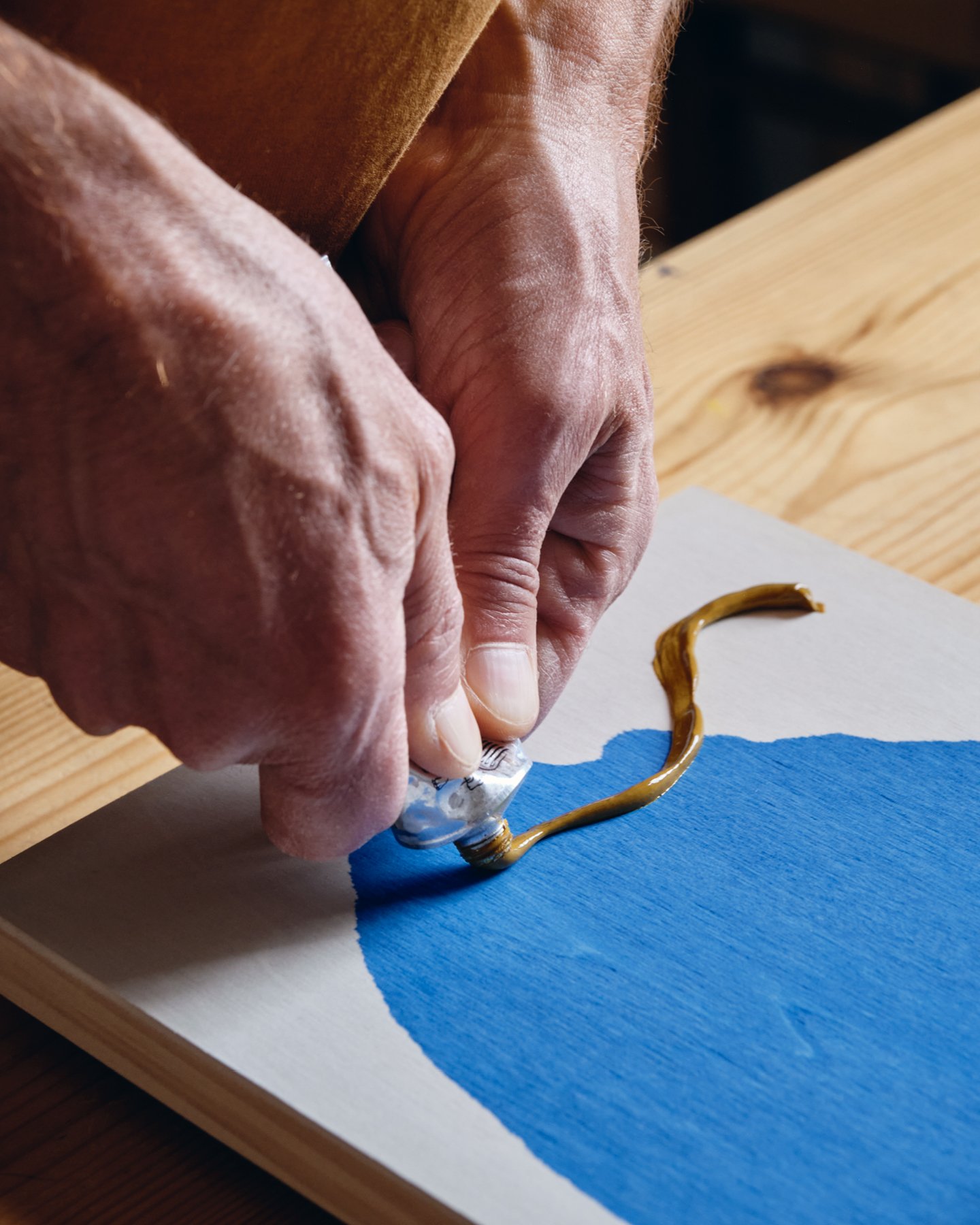
Eatock prepares to make a Rolling Pin Painting (left), several of which are displayed throughout his studio (right).
At the same time that Eatock encountered and embraced this perspective, progressive graphic designers were questioning the service-based model of the discipline and pioneering an idea of autonomous practice, defined by the term “graphic authorship.” Initiating their own work for its own sake, these designers sought stylistic freedom, testing the limits of legibility, challenging definitions of beauty, and proving that they could function without the patronage of clients. It still looked like graphic design—albeit a more experimental variant.
Eatock’s work, conversely, does not look like graphic design. This is partly due to his interest in making work that uses materials and tools not commonly associated with the practice. In addition to putting rolling pins to creative purposes, he uses the humble clip frame to make paintings: placing acrylic paint on the backing board, he then secures the glass, generating different results based on the placement and amount of paint, as well as his decisions to lift, rotate, and re-affix the glass. With such projects, Eatock has evolved a different type of authorship, one that curator and designer Andrew Blauvelt has offered as “a conceptual authorship governing the operations of a project to be executed within specific parameters.” Specifically, Eatock’s authorship is one of uncertainty and chance.
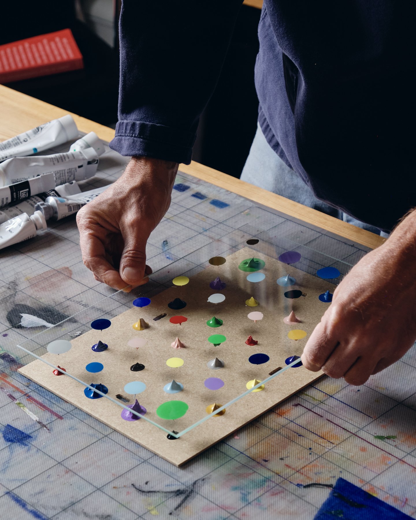
For Clip Frame Paintings, Eatock cycles through dabbing paint, affixing then lifting the glass, adding more paint, and repositioning the glass.
Blauvelt played an important role in Eatock’s growth as a creative practitioner. In 1998, as the newly appointed design director of the Walker Art Center in Minneapolis, he invited Eatock to join the in-house design team. “I hadn’t worked in a commercial environment before, and I didn't recognize the hierarchies within a contemporary art museum,” recalls Eatock. “I would knock on the senior curator’s door and say, ‘Hello, tell me about your exhibition.’ For whatever reason, the other designers didn’t do this, but I didn’t feel the same restraints.”
After one year in Minneapolis, Eatock returned to London, and in partnership with the architect Sam Solhaug, established the collaborative studio Foundation 33. With a near total disregard for design world norms, the studio made furniture, designed the logo for the hit TV show Big Brother, and created the world’s largest signed and numbered limited-edition artwork—one million postcards signed by the entire studio over 12 days.
Foundation 33 was disbanded in 2005 and after a brief stint with a small, short-lived advertising agency, Eatock began his solo practice.
Ignoring conventional restraints and carving out a singular path has been the defining feature of Eatock’s work since the beginning. But it would be a mistake to suggest he is an entirely free spirit. His work might appear to be the outcome of experimentation and play, but it is in fact highly method-driven experimentation and play—in endless pursuit of the next of his beloved ideas.
While we marvel at Eatock’s creative fecundity and envy his productivity, it comes as a surprise to learn that he begins every project with the thought that it will fail, “and/or” as he clarifies later with a wink, “change the world forever.” In this, Eatock offers the rest of us some consolation: the realization that not every idea merits further exploration, but that through a dogged pursuit of work, something of value will emerge. ❤
At Kazam! Magazine we believe design has the power to change the world. Our stories feature people, projects, and ideas that are shaping a better tomorrow.